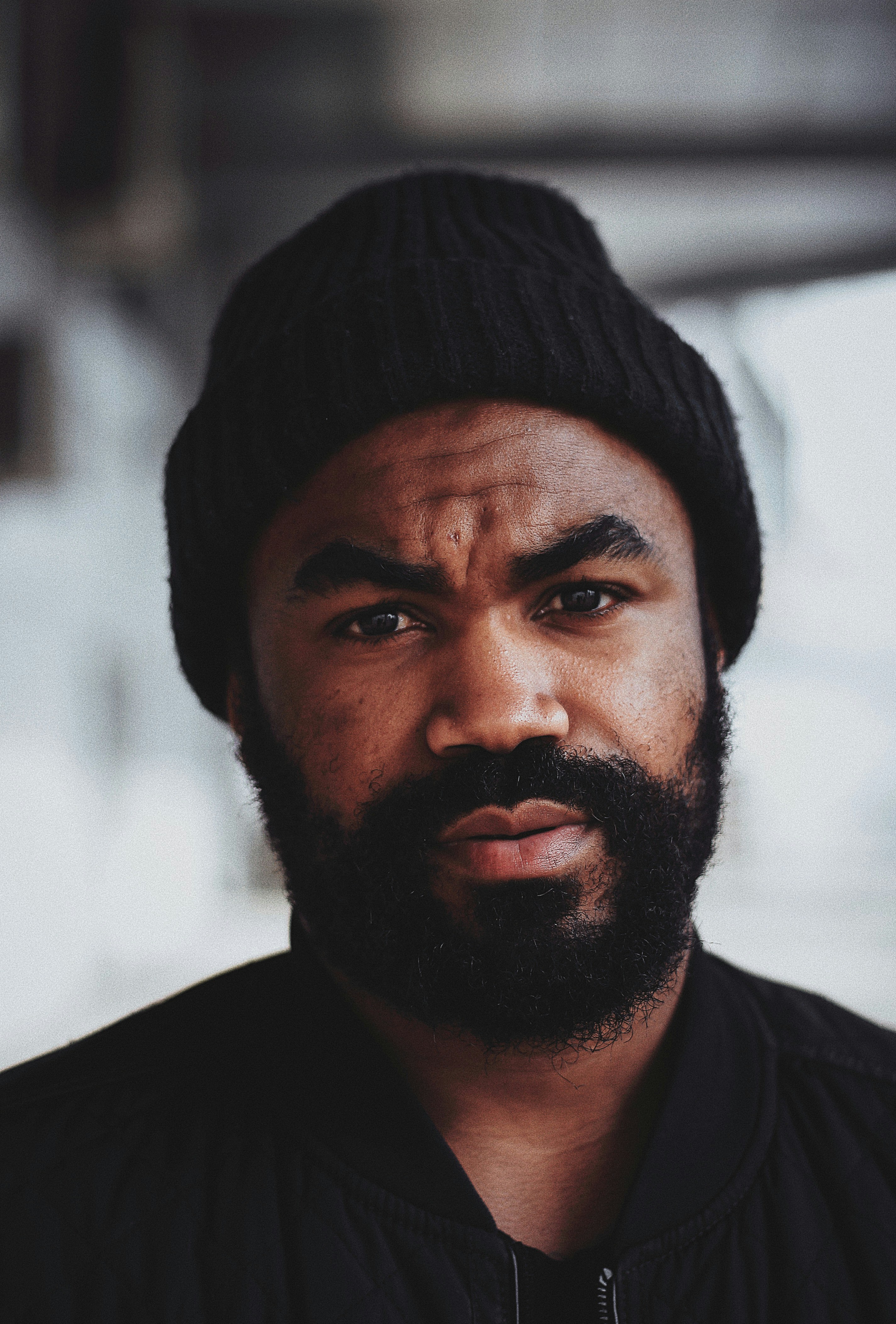
Hello, I'm Ashley 👋
A UX/UI Designer Crafting Intuitive Interfaces, and Seamless Journeys

About
I'm a Developer Turned UX/UI Designer
I'm a Michigan Based UX/UI and Product Designer with a strong background in UI, web design, teaching, and frontend development. I simplify complex user journeys into accessible solutions that ensure an increase in qualified conversions. When i'm not working or teaching you can find me gaming or outside enjoying everything Michigan has to offer.
If you are interested in booking a class or a 1:1 mentoring session with me you can do so on Path Unbound.
Years of experience
7+
Projects Completed
25+
Hours of Designing
10,000+
Hours Playing Balder's Gate 3
30+


Crafting stunning products that not only look incredible but also drive results. My goal? To create solutions that satisfy both users and businesses alike. Say goodbye to one-sided designs—together, we’ll create experiences that elevate your brand and help you scale to new heights!
Unreal Engine
React
Figma
InDesign
Framer
Zeplin
Wordpress
HTML
CSS
Javascript
Career
This Is My Career
UX/UI Instructor @ Path Unbound
2025
-
Now
As a UX/UI instructor at Path Unbound, I bring my extensive experience in designing accessible, user-centered products to empower students in their journey to becoming skilled designers. With a strong foundation in design systems, iterative workflows, and best practices like WCAG compliance, I guide learners in mastering tools and techniques to create impactful digital experiences. I offer 1:1 mentoring sessions and classes on UX/UI Design and low-code, no-code development on a part-time basis.
Senior Product Designer @ Ford Motor Company
2023
-
2024
A year long contract with Ford Motor Company, leading the design of a Mustang enthusist mobile app and the Special Vehicle Registration site redesign. Work facilitated by Campbell Marketing & Communications.
Product Designer @ Coin Metrics
2022
-
2023
At Coin Metrics I designed user-centric interfaces and dashboards for complex cryptocurrency analytics and collaborated with cross-functional teams to deliver scalable, intuitive blockchain data tools. I also helped to build and maintain the Coin Metrics design system and branding.
UX/UI Designer + Developer @ Fidelity Payment Services
2021
-
2022
Designed and developed marketing websites in Wordpress and Divi, creating visually apealing user interfaces for a variety of Fidelity's products and services. Designed with Figma and Sketch, prepared designs for handoff to developers with Zeplin. Helped to create the first version of the Fidelity Payment Services design system.
Why me?
A Proven Process

Defining Needs & Pain Points
Doing the research to define the user needs and pain points as well as the businees goals. Melting the business goals and user needs into a perfetly blended design solution centered around solving real problems.

Ideate & Itterate
I work closely with you, integrating your feedback to create designs that exceed your expectations. From mapping out the user journey, to high-fidelity designs, I collobrate with you through it all.

Prototyping, Testing, & Handoff
I prototype and test to evaluate real-time interactions by users. I collobrate with developers to test and visually inspect designs as they are developed into your final product ensuring quality and providing design support.
Testimonials
See What Others Say About Me
I've had the privilege of working alongside some of the best in the industry. They've not only shared their knowledge and expertise but have also been kind enough to share encouraging words about my work.
I worked with Ashley on an internal website for Salesforce's Lightning Design System. She was great to work with - eager to help, an excellent communicator, and a quick learner. I would certainly welcome another opportunity to work with her!

Becca Y.
Director, Design Systems UX @ Salesforce
Ashley has a can do attitude, is easy to collaborate with, and is always one step ahead of marketing asks. She is incredibly creative and skilled in her craft, having an eye for both aesthetics and functionality. Ashley is super communicative and kind and I'd recommend her to anyone. I would love to have the opportunity to work together again!

Gina R.
Marketing Leader || Head of Marketing @ Coin Metrics
Ashley is always thinking ahead and future-proofing every project. In Figma, she’s a powerhouse with components, design systems, and prototyping, keeping accessibility and responsiveness top of mind. What makes her even more impressive is her coding knowledge,

Cortney H.
Web/UI Designer @ Campbell Marketing & Communications
I had the pleasure of working alongside Ashley on some web contract work. Her keen eye for design is only matched by her multi-faceted talent pool. She delivered designs with precision and excellence that exceeded the clients expectations. I would recommend her talent to anyone.

Raymond C.
Senior Software Developer @ Pella Corp
Ashley is an excellent web developer, both technically and creatively. She is genuinely skilled with many frameworks, has excellent communication, and fit into our team immediately and comfortably. Highly recommend her!

Eric G.
Owner and Designer @ Vastcore
I'm truly grateful for the time I got to work under Ashely because she has a great eye for design, outstanding problem solving skills and knows how to move a team forward. If you have her as an employee nurture her talent and add growth to her career your going to be amazed at the work she will do for you.
David R.
Cybersecurity Professional @ Comcast
FAQ
Frequently Asked Questions
How do you ensure that your designs meet user needs and business goals?
Are you open to full-time, part-time, contract, or freelance work?
Can you walk me through a specific project in your portfolio?
What tools and software do you use for your design work?
What is your design process, and how do you approach new projects?
Did not find the answer you're looking for?
Contact ashleym@thedesignerdev.com

Contact
Let's Get in Touch
Let's connect and start with your project ASAP.
Or email ashleym@thedesignerdev.com
Hello, I'm Ashley 👋
A UX/UI Designer Crafting Intuitive Interfaces, and Seamless Journeys
About
I'm a Developer Turned UX/UI Designer
I'm a Michigan Based UX/UI and Product Designer with a strong background in UI, web design, teaching, and frontend development. I simplify complex user journeys into accessible solutions that ensure an increase in qualified conversions. When i'm not working or teaching you can find me gaming or outside enjoying everything Michigan has to offer.
If you are interested in booking a class or a 1:1 mentoring session with me you can do so on Path Unbound.
Years of experience
7+
Projects Completed
25+
Hours of Designing
10,000+
Hours Playing Balder's Gate 3
30+
Crafting stunning products that not only look incredible but also drive results. My goal? To create solutions that satisfy both users and businesses alike. Say goodbye to one-sided designs—together, we’ll create experiences that elevate your brand and help you scale to new heights!
Unreal Engine
React
Figma
InDesign
Framer
Zeplin
Wordpress
HTML
CSS
Javascript
Career
This Is My Career
UX/UI Instructor @ Path Unbound
2025
-
Now
As a UX/UI instructor at Path Unbound, I bring my extensive experience in designing accessible, user-centered products to empower students in their journey to becoming skilled designers. With a strong foundation in design systems, iterative workflows, and best practices like WCAG compliance, I guide learners in mastering tools and techniques to create impactful digital experiences. I offer 1:1 mentoring sessions and classes on UX/UI Design and low-code, no-code development on a part-time basis.
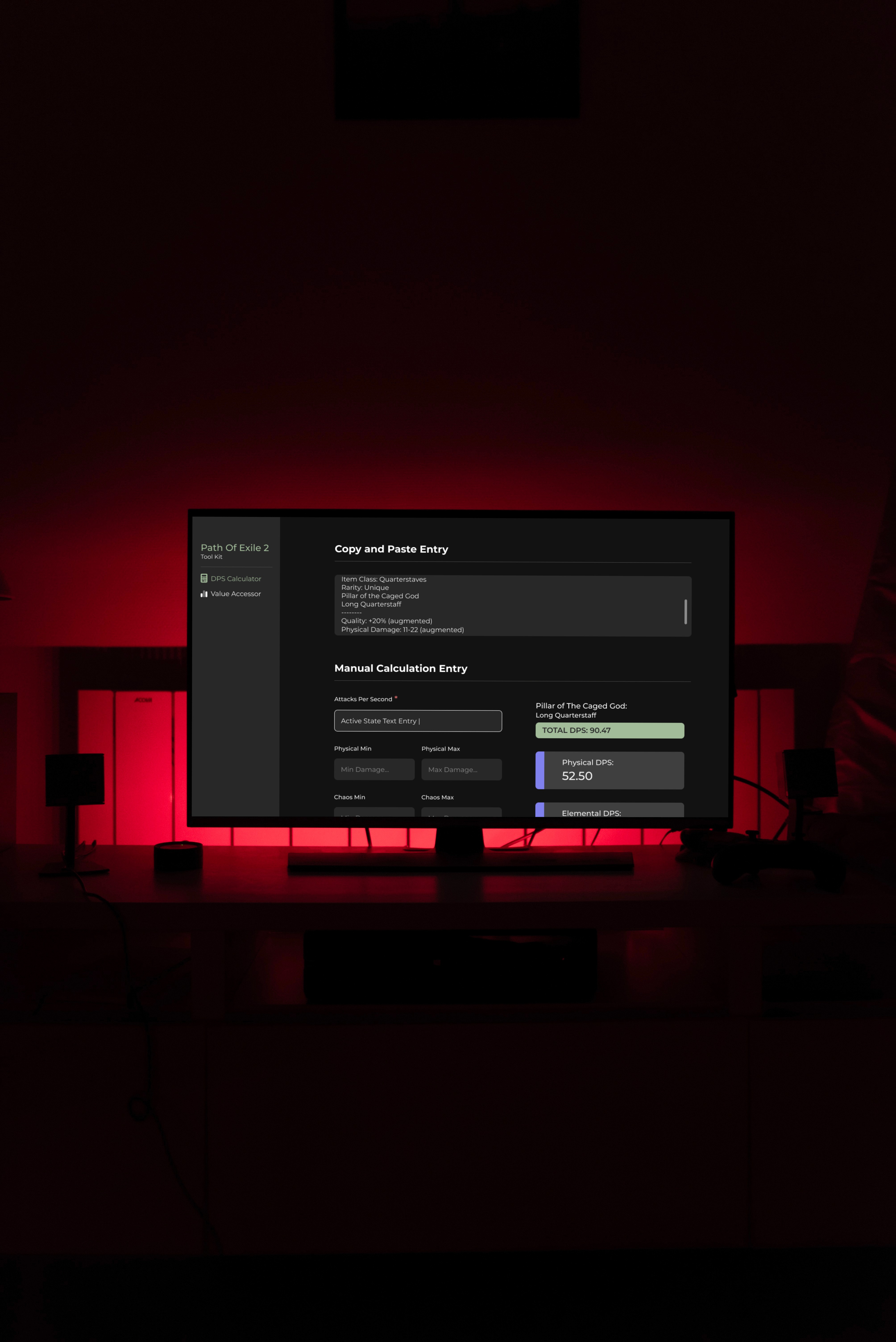
Senior Product Designer @ Ford Motor Company
2023
-
2024
A year long contract with Ford Motor Company, leading the design of a Mustang enthusist mobile app and the Special Vehicle Registration site redesign. Work facilitated by Campbell Marketing & Communications.
Product Designer @ Coin Metrics
2022
-
2023
At Coin Metrics I designed user-centric interfaces and dashboards for complex cryptocurrency analytics and collaborated with cross-functional teams to deliver scalable, intuitive blockchain data tools. I also helped to build and maintain the Coin Metrics design system and branding.
UX/UI Designer + Developer @ Fidelity Payment Services
2021
-
2022
Designed and developed marketing websites in Wordpress and Divi, creating visually apealing user interfaces for a variety of Fidelity's products and services. Designed with Figma and Sketch, prepared designs for handoff to developers with Zeplin. Helped to create the first version of the Fidelity Payment Services design system.
Why me?
A Proven Process
Defining Needs & Pain Points
Doing the research to define the user needs and pain points as well as the businees goals. Melting the business goals and user needs into a perfetly blended design solution centered around solving real problems.
Ideate & Itterate
I work closely with you, integrating your feedback to create designs that exceed your expectations. From mapping out the user journey, to high-fidelity designs, I collobrate with you through it all.
Prototyping, Testing, & Handoff
I prototype and test to evaluate real-time interactions by users. I collobrate with developers to test and visually inspect designs as they are developed into your final product ensuring quality and providing design support.
Testimonials
See What Others Say About Me
I've had the privilege of working alongside some of the best in the industry. They've not only shared their knowledge and expertise but have also been kind enough to share encouraging words about my work.
I worked with Ashley on an internal website for Salesforce's Lightning Design System. She was great to work with - eager to help, an excellent communicator, and a quick learner. I would certainly welcome another opportunity to work with her!
Becca Y.
Director, Design Systems UX @ Salesforce
Ashley has a can do attitude, is easy to collaborate with, and is always one step ahead of marketing asks. She is incredibly creative and skilled in her craft, having an eye for both aesthetics and functionality. Ashley is super communicative and kind and I'd recommend her to anyone. I would love to have the opportunity to work together again!
Gina R.
Marketing Leader || Head of Marketing @ Coin Metrics
Ashley is always thinking ahead and future-proofing every project. In Figma, she’s a powerhouse with components, design systems, and prototyping, keeping accessibility and responsiveness top of mind. What makes her even more impressive is her coding knowledge,
Cortney H.
Web/UI Designer @ Campbell Marketing & Communications
I had the pleasure of working alongside Ashley on some web contract work. Her keen eye for design is only matched by her multi-faceted talent pool. She delivered designs with precision and excellence that exceeded the clients expectations. I would recommend her talent to anyone.
Raymond C.
Senior Software Developer @ Pella Corp
Ashley is an excellent web developer, both technically and creatively. She is genuinely skilled with many frameworks, has excellent communication, and fit into our team immediately and comfortably. Highly recommend her!
Eric G.
Owner and Designer @ Vastcore
I'm truly grateful for the time I got to work under Ashely because she has a great eye for design, outstanding problem solving skills and knows how to move a team forward. If you have her as an employee nurture her talent and add growth to her career your going to be amazed at the work she will do for you.
David R.
Cybersecurity Professional @ Comcast
FAQ
Frequently Asked Questions
How do you ensure that your designs meet user needs and business goals?
Are you open to full-time, part-time, contract, or freelance work?
Can you walk me through a specific project in your portfolio?
What tools and software do you use for your design work?
What is your design process, and how do you approach new projects?
Did not find the answer you're looking for?
Contact ashleym@thedesignerdev.com
Contact
Let's Get in Touch
Let's connect and start with your project ASAP.
Or email ashleym@thedesignerdev.com
Hello, I'm Ashley 👋
A UX/UI Designer Crafting Intuitive Interfaces, and Seamless Journeys
About
I'm a Developer Turned UX/UI Designer
I'm a Michigan Based UX/UI and Product Designer with a strong background in UI, web design, teaching, and frontend development. I simplify complex user journeys into accessible solutions that ensure an increase in qualified conversions. When i'm not working or teaching you can find me gaming or outside enjoying everything Michigan has to offer.
If you are interested in booking a class or a 1:1 mentoring session with me you can do so on Path Unbound.
Years of experience
7+
Projects Completed
25+
Hours of Designing
10,000+
Hours Playing Balder's Gate 3
30+
Crafting stunning products that not only look incredible but also drive results. My goal? To create solutions that satisfy both users and businesses alike. Say goodbye to one-sided designs—together, we’ll create experiences that elevate your brand and help you scale to new heights!
Unreal Engine
React
Figma
InDesign
Framer
Zeplin
Wordpress
HTML
CSS
Javascript
Career
This Is My Career
UX/UI Instructor @ Path Unbound
2025
-
Now
As a UX/UI instructor at Path Unbound, I bring my extensive experience in designing accessible, user-centered products to empower students in their journey to becoming skilled designers. With a strong foundation in design systems, iterative workflows, and best practices like WCAG compliance, I guide learners in mastering tools and techniques to create impactful digital experiences. I offer 1:1 mentoring sessions and classes on UX/UI Design and low-code, no-code development on a part-time basis.
Senior Product Designer @ Ford Motor Company
2023
-
2024
A year long contract with Ford Motor Company, leading the design of a Mustang enthusist mobile app and the Special Vehicle Registration site redesign. Work facilitated by Campbell Marketing & Communications.
Product Designer @ Coin Metrics
2022
-
2023
At Coin Metrics I designed user-centric interfaces and dashboards for complex cryptocurrency analytics and collaborated with cross-functional teams to deliver scalable, intuitive blockchain data tools. I also helped to build and maintain the Coin Metrics design system and branding.
UX/UI Designer + Developer @ Fidelity Payment Services
2021
-
2022
Designed and developed marketing websites in Wordpress and Divi, creating visually apealing user interfaces for a variety of Fidelity's products and services. Designed with Figma and Sketch, prepared designs for handoff to developers with Zeplin. Helped to create the first version of the Fidelity Payment Services design system.
Why me?
A Proven Process
Defining Needs & Pain Points
Doing the research to define the user needs and pain points as well as the businees goals. Melting the business goals and user needs into a perfetly blended design solution centered around solving real problems.
Ideate & Itterate
I work closely with you, integrating your feedback to create designs that exceed your expectations. From mapping out the user journey, to high-fidelity designs, I collobrate with you through it all.
Prototyping, Testing, & Handoff
I prototype and test to evaluate real-time interactions by users. I collobrate with developers to test and visually inspect designs as they are developed into your final product ensuring quality and providing design support.
Testimonials
See What Others Say About Me
I've had the privilege of working alongside some of the best in the industry. They've not only shared their knowledge and expertise but have also been kind enough to share encouraging words about my work.
I worked with Ashley on an internal website for Salesforce's Lightning Design System. She was great to work with - eager to help, an excellent communicator, and a quick learner. I would certainly welcome another opportunity to work with her!
Becca Y.
Director, Design Systems UX @ Salesforce
Ashley has a can do attitude, is easy to collaborate with, and is always one step ahead of marketing asks. She is incredibly creative and skilled in her craft, having an eye for both aesthetics and functionality. Ashley is super communicative and kind and I'd recommend her to anyone. I would love to have the opportunity to work together again!
Gina R.
Marketing Leader || Head of Marketing @ Coin Metrics
Ashley is always thinking ahead and future-proofing every project. In Figma, she’s a powerhouse with components, design systems, and prototyping, keeping accessibility and responsiveness top of mind. What makes her even more impressive is her coding knowledge,
Cortney H.
Web/UI Designer @ Campbell Marketing & Communications
I had the pleasure of working alongside Ashley on some web contract work. Her keen eye for design is only matched by her multi-faceted talent pool. She delivered designs with precision and excellence that exceeded the clients expectations. I would recommend her talent to anyone.
Raymond C.
Senior Software Developer @ Pella Corp
Ashley is an excellent web developer, both technically and creatively. She is genuinely skilled with many frameworks, has excellent communication, and fit into our team immediately and comfortably. Highly recommend her!
Eric G.
Owner and Designer @ Vastcore
I'm truly grateful for the time I got to work under Ashely because she has a great eye for design, outstanding problem solving skills and knows how to move a team forward. If you have her as an employee nurture her talent and add growth to her career your going to be amazed at the work she will do for you.
David R.
Cybersecurity Professional @ Comcast
FAQ
Frequently Asked Questions
How do you ensure that your designs meet user needs and business goals?
Are you open to full-time, part-time, contract, or freelance work?
Can you walk me through a specific project in your portfolio?
What tools and software do you use for your design work?
What is your design process, and how do you approach new projects?
Did not find the answer you're looking for?
Contact ashleym@thedesignerdev.com
Contact
Let's Get in Touch
Let's connect and start with your project ASAP.
Or email ashleym@thedesignerdev.com